Approaches to Visualizing Projections Models
Overview
Succinct tabular data can be extremely effective in communication. Carefully thought through tables, oriented around specific conclusions, are powerful. They are well suited to board meeting environments, and don’t consumption of such tables requires deep expertise in finance as long as they are well-designed. Data plots are an excellent companion or alternative to tabular data, but to reach their maximum potential need thought applied in design–the whole “pictures are a thousand words” thing. With either tabular or plot, design can make them so specific as to be single purpose or even just one-time use.
Discussed here are a variety of fairly standard plots for communicating projections and financial performance for start-up companies.
Operating Cashflow & Cash Balance
This is one of my most frequently used charts. It communicates clearly the change in cash balance over a timeline, usually less than that of the overall model.
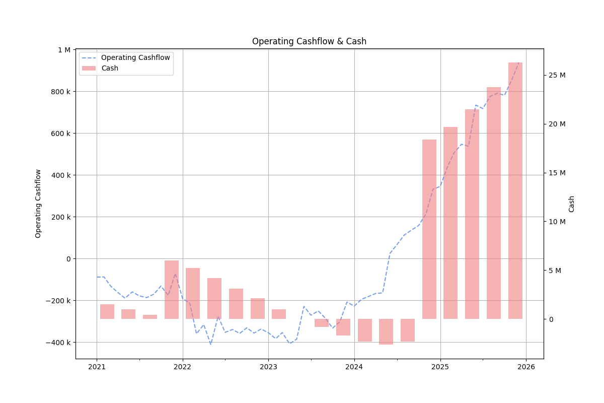
Figure 1: Operating cashflow and cash balance
Overlaying the operational cash flow helps show when the company expects to start generating cash rather than being in burn mode. That point, for most startups, is concurrent with the overall cash asset beginning to increase. Cash burn and expected change in cash burn should be of prime focus pretty much at any stage of a startups growth.
Variance charts
Companies and startups that have a well-functioning finance department are regularly reviewing their forecast plans against the actual financial activity. A key to good financial management is a cyclical analysis of what you expected to happen compared to what did happen, an assessment of why there were differences and then revision of forecast plans based on the new knowledge obtained. The insights gained are incremental and build up to a very comprehensive understanding of the business over time. The process of comparing forecast to actuals is most commonly known as variance analysis.
The easiest and most used variance analysis is on the income statement. Dual comparisons of the absolute variance should be combined with percentage variance. Both perspectives are important in understanding overall importance in the variance and to what degree the forecast should be revised.
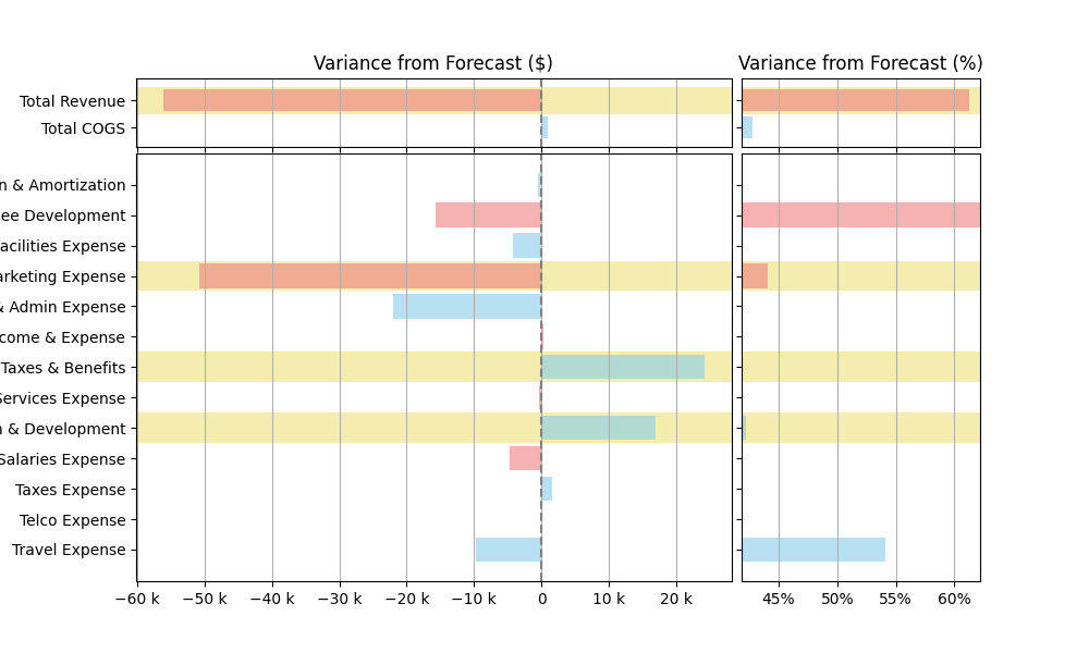
Figure 2: Income statement variance
The income statement variance is the most intuitive and easily understood. In full three-statement models there are variances in the balance sheet projection. The figure below shows, as an example, how deferred revenue and accounts receivable differ from forecast. Understanding the underlying factors would involve reviewing contract details, invoicing and payments activity.
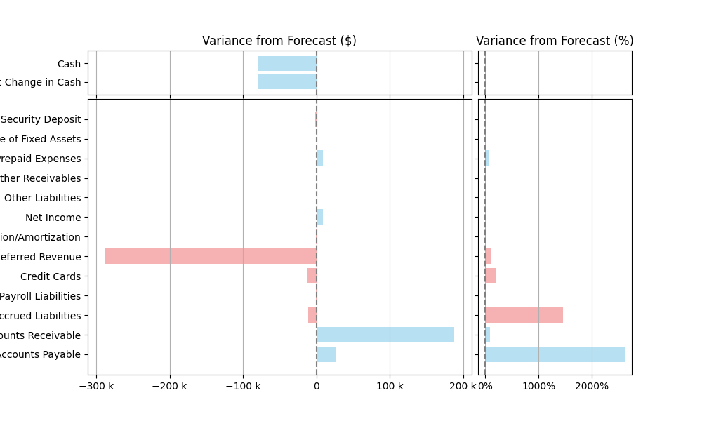
Figure 3: Balance sheet variance
However, the conceptual nature of these analyses is more of a challenge for those not fluent in accounting and financial statements. It can be easier to focus on aggregate effects from the balance sheet as compared to that of the income statement, and address underlying factors separately.
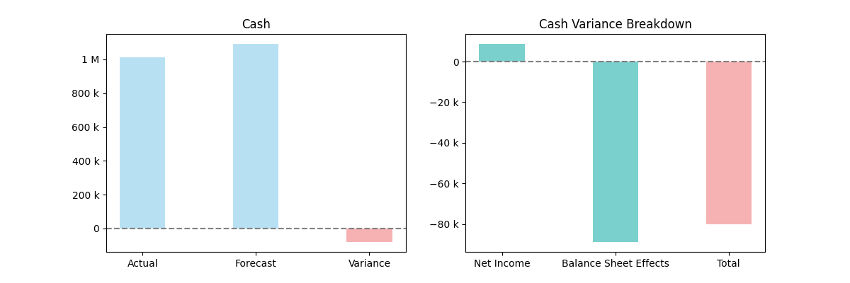
Figure 4: Cash and variance breakdown
It is reasonable to measure performance of the operational insight by the accuracy of the income statement variance and the performance of the financial insight by the accuracy of the balance sheet variance. Balance sheet variances typically derive from financial processes, whereas income statement variances are often down to inaccurate visibility of the business' activity.
Forecast scenarios
Scenario forecasting is an essential part of building financial projections. Testing the assumptions of the model validate its structure and will then help build a comprehensive understanding of how the business can react to different situations.
A common approach is best versus worst case, but both extremes can be relatively unlikely to occur. A more useful in practice is working through a forecast that represents a strong probability and then comparing to a baseline of no growth progress beyond that current achieved. The latter can be represented simply by continuance of the current revenue and expense levels. These two limits are more intuitive and result in cash burn and runway projections that are more relevant in practice.
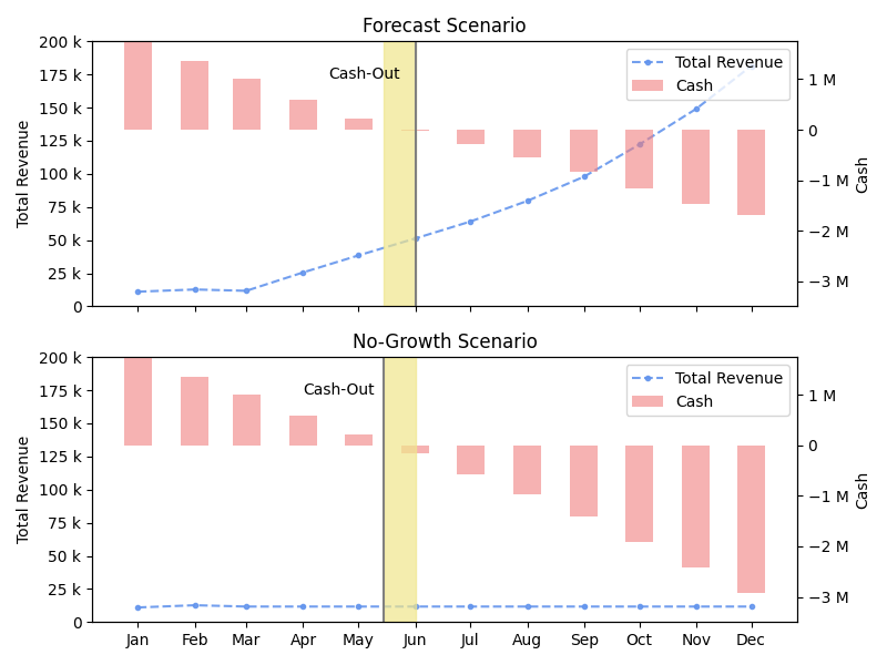
Figure 5: Forecast scenarios
The figure above has an example where the differential between growth and baseline is fairly small, due mostly to the minimal short-term cash effect from revenue growth in the forecast scenario. But the differential can be notable in other situations and the baseline gives a very effective ground zero for planning and risk purposes.
Summary
Effective visualization approaches are key with financial models. Consumers of the information may or may not have a solid background in finance and accounting. It is, therefore, important to determine the key conclusions to communicate and design the visualization around that. The examples covered above are proven approaches suitable for both internal management use and with board and investors.